My.torontomu Student portal is a comprehensive online platform designed to provide Toronto Metropolitan University students with easy access to academic resources, course management, and personalized services to support their educational journey.

My Role
UI designer
UX researcher
Project Over View
This project redesigned Toronto Metropolitan University’s document request task, streamlined the submission process, reducing the steps required and integrating clear, step-by-step guidance. The redesign also introduced real-time status tracking, significantly improving the transparency and efficiency of the document request experience for students.
Problem
- Information Overload: The current design lacks a clear information hierarchy, some information are repetitive, resulting in a crowded site.
- Navigation Issues: Users have trouble finding certain features or resources owing to confused navigation.

Hypothesis:
I assume that past or current students from Toronto MU are having a hard time find the right place to request any documents from school, therefore, I hypothesise that if I reduce the amount of steps user need to take to request any documents from school and re-organize information with clearer information architecture, student will spend less time find what they need.
Proposed solutions
Create a clear information hierarchy to reduce complexity.
Reduce repeated information to create a more visually appealing design.
Provide status tracking on home page and document request page to provide efficiency.
Tools and Durations
Tools:
Figma.
Duration:
1 Month
Deliverables
Figma design prototype
UX Research Plan
Our main objective in redesigning the university student portal is to enhance user clarity and streamline various academic and administrative processes, thereby addressing the broad range of challenges and inefficiencies faced by students.
User Interview
Target Interviewers:
University Students: They interact directly with the student portal and may offer feedback on their daily usage and pain points
3 parts of interview
Part 1: Current platform testing, learn about current user flows and average user flow time.
Part 2: wireframe A/B testing
Part 3: Final User testing
Findings:
Regular Engagement
Students access the portal 3-4 times a week, showing regular use.
Priority on Course-related Tasks
Students consider course related tasks as the most important tasks to do.
Crucial Document Requests for International Students
Other tasks including requesting letters such as official transcript, requesting other documents such as proof of enrollment are very important toward international students
Instructional Overwhelm
Some students felt overwhelmed when reading a lot of instructional text and options, for those that had experience requesting documents in the past, they chose to skip the instructions or skim through the instructions.
Ease for Former Students
The overall process seems to trouble the ones that have never or rarely used this toronto. For former students, recent graduate students these steps seem to be more familiar to them and took less time to complete.
Information Hierarchy Challenge
Lack of information hierarchy and massive amount of tabs seems to be troubling the student the most
Balancing Act
Although students find the instruction overwhelming, they still consider the instructions as a very important part and they appreciate the fact that the instructions were written.
User Need:
- Essential information such as class information,student services, and announcements are clearly visible and easily accessible.
- Clear instruction but with less words, considering replace with image instructions
- Clear information hierarchy that differentiate each steps or each categories
User Want:
Clear, easy to access home page with well-organized, clear hierarchical structure navigation system.
Current Design Problem


Current website Design problems:
Clear information hierarchy is lacking, leading to overwhelm.
Navigation, especially for specific features, is confusing.
A cluttered site makes it difficult to access information quickly.
Difficulty in locating academic resources and event details.
Empathy Mapping

Top Takeaways:
Although every user type, including new, returning, and current students, has different demands and difficulties, there are a few general themes that apply to all user groups:
- Campus-Only Use: The app is primarily used on campus, suggesting limited off-campus engagement.
- Disconnected Expectations: Expectations vary significantly among different user groups, leading to a disjointed experience.
- Limited Customizability: A lack of personalization options discourages user engagement with the app.
User Persona
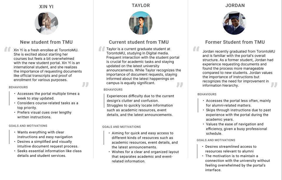
User persona for:
New student from TMU
Current Student from TMU
Former Student from TMU
Xin Yi, a newcomer to TMU, wants clear, visual guides for using the student portal and easy document handling. Taylor, a current student, needs an organized portal for quick access to information and updates. Jordan, a TMU alumnus, prefers a simple, professional-friendly portal for occasional use.
In response, our platform was tailored with visual clarity and simplified document access for Xin Yi, streamlined information organization for Taylor, and an efficient, non-intrusive experience for Jordan. These adjustments were essential to cater to their specific user experiences.
User Journey

Lo-fidelity Wireframe
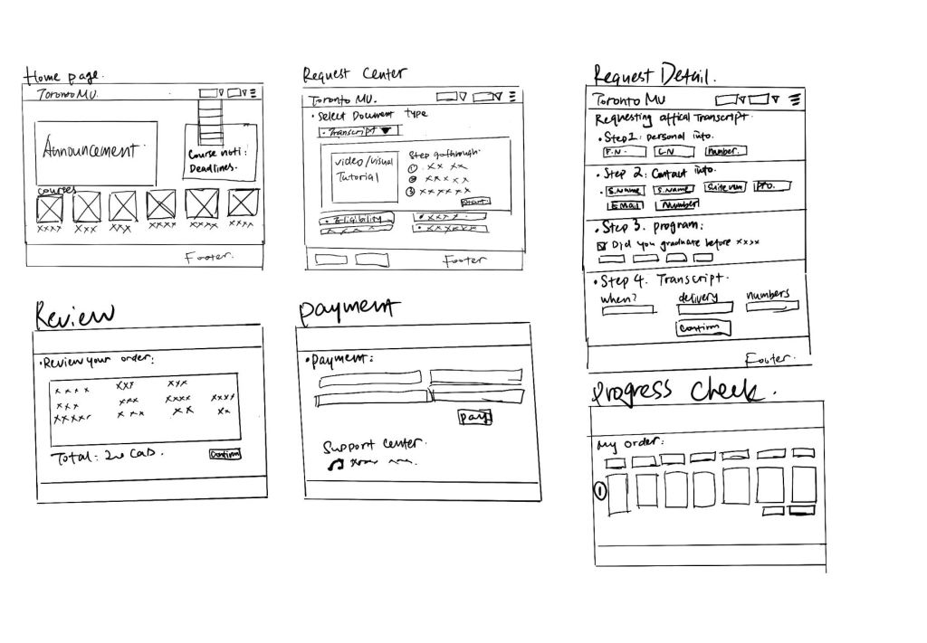
By conducting this lo-fi wireframe, I am able to reveals user interaction patterns and pain points, which informs iterative design improvements for a more intuitive and user-centric portal experience.
this Lo-fidelity wireframes address key user pain points by ensuring clarity of navigation, offering visual and hierarchical information presentation, and incorporating features for assistance and status tracking. The focus on reducing confusion, improving the request process, and enhancing the user experience is evident, and these wireframes lay a strong foundation for the further development of the TMU student portal.
A/B Testing for Mid-Fidelity wireframes
After finishing the lo-fidelity wireframe, the next phase involved designing mid-fidelity wireframes. These were then presented to a selected group of our target audience for an A/B testing session to gather valuable feedback. This approach ensures that the design not only meets aesthetic standards but also aligns with user expectations and usability.
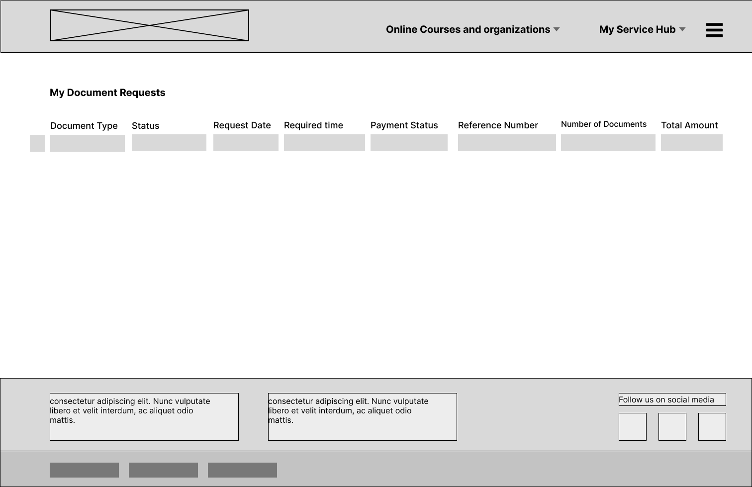
Home Page


wireframe on the left(old TMU student portal Home page)
- Content-rich, possibly overwhelming.
- Multiple navigation paths, can cause decision fatigue to new or potential student user.
- Dense information blocks, may affect findability for new or potential students user.
- Traditional design, lacks modern touch.
wireframe on the Right (New designed student portal Home page)
- More focused, organized layout which is cleaner.
- simplified navigation that might be less confusing.
- Course and announcement focus that fulfills most students needs.
- Clearly defined sections enhance the hierarchy of content.
- Probably more appealing since it is with modern design.
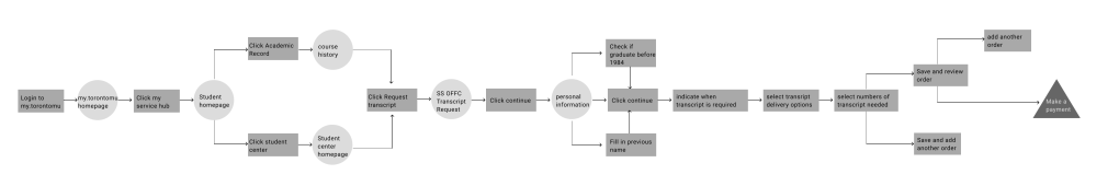
Student portal page /Document request page
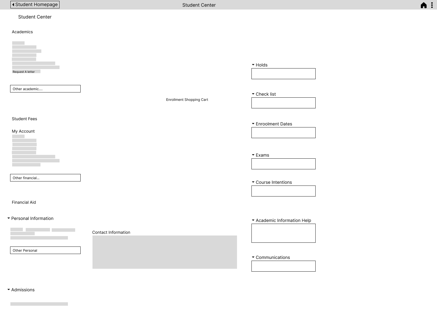
wireframe on the left(Multitask: Student center page with Request a letter option)
- Dropdowns might reduce visual clutter but hide options.
- Could use more navigational cues.
- Too much information, hard to streamline the request letter task.
- Easy for students that are not familiar wit the website to gather all the necessary information.
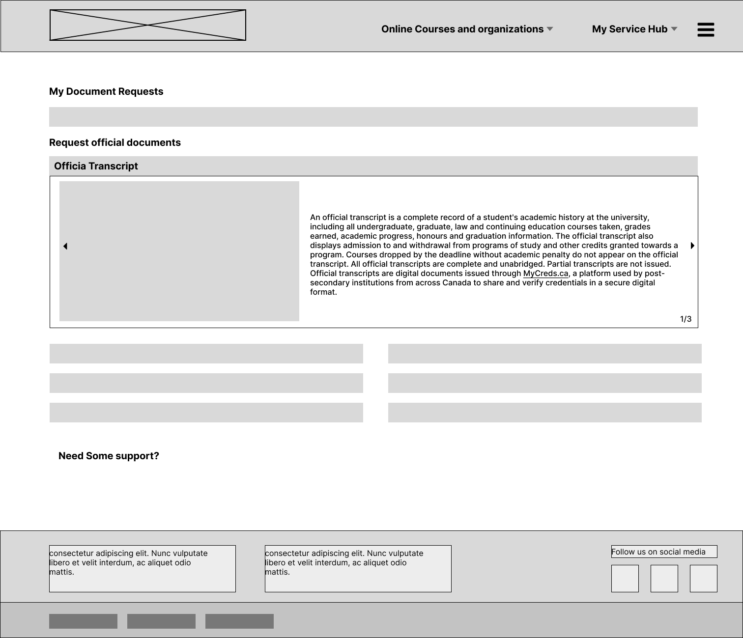
wireframe on the Right (Single task: New designed request transcript)
- The page seems dedicated to a singular task, which is requesting documents, likely simplifying the user’s task.
- This wireframe have a clear linear flow, which is ideal for form completion processes.
- My document request shows current task progress, which is very useful for the ones that have very limited time.
- Visual and text explanation is very user friendly for users like new and potential students.
Instruction page

wireframe on the left(TMU’s instruction page)
- Massive amount of information
- links are embedded in the body text, hard to navigate
- Review order is helpful for user to find their previous order and any current unfinished order
wireframe on the Right (New designed Instruction+information page)
- Saves one step for user, easier for user to navigate.
- Visual instructions is less overwhelming and easier to understand.
Information page
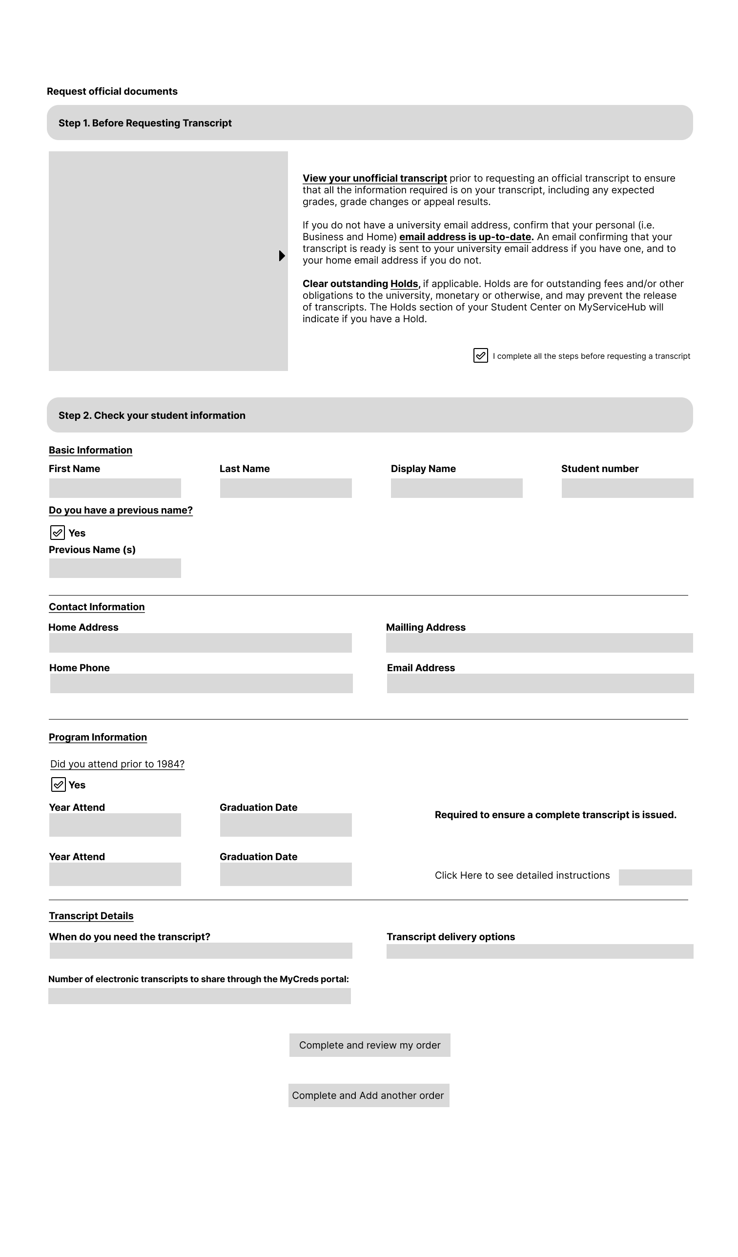
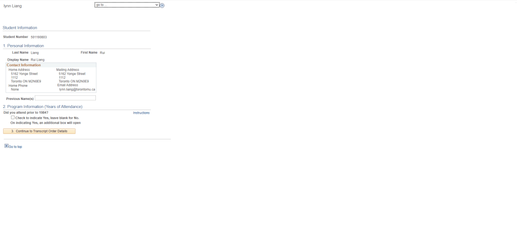
wireframe on the left(TMU’s information page)
- A lot of information presented without clear grouping, which lead to cognitive overload.
- It’s not immediately clear which elements are clickable or interactive, causing user confusion.
- could incorporate more immediate feedback mechanisms post-action.
- Responsive design problem.
wireframe on the Right (New designed information page)
- Some form fields appear to be optional or conditional ( ‘Did you attend prior to 1984?’), but it’s not clear how the user should interact with these unlike the other wireframe.
- The steps are not consistently marked, which can cause confusion about the sequence of actions.
- Support options or help text could be more prominent to aid users who need assistance.
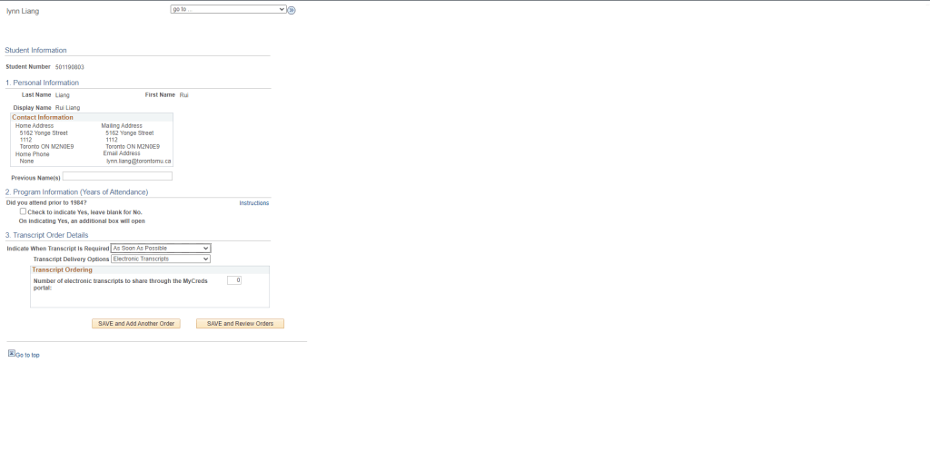
My Order page
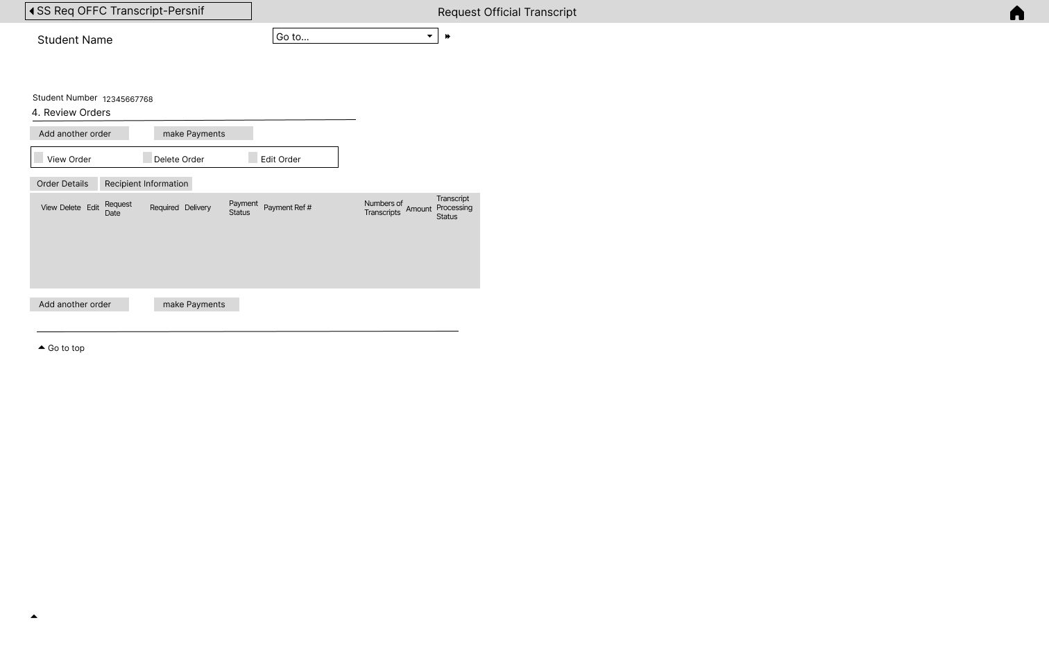
wireframe on the left(TMU’s my order page)
Unclear visual hierarchy may lead to confusion about the process flow.
The ‘Go to…’ dropdown is ambiguous without context on what options it provides.
wireframe on the Right (New designed my order page)
Lack of interaction buttons such as delete, details etc.
Clearer visual hierarchy structure.
arrange each section based on their importance is very straight forward, easy for students to grasp the importance information.
Final Outcome
- The information form features a uniform marking system for each step, ensuring a coherent flow throughout the user journey.
- Actionable buttons have been strategically incorporated into the ‘My Document’ page to facilitate user interaction.
- Support mechanisms have been integrated at various stages to provide users with assistance as needed.
- A singular focus has been employed to streamline the document request process, enhancing task efficiency.
- The interface now includes a visible tracker for current order progress, offering students immediate access to their request statuses.
Result
We conducted our final user testing, conducted another interview with our target user regarding this newly designed platform, and here is what we found:
- Increased user satisfaction scores due to the streamlined process and improved interface clarity.
- Improved navigation efficiency, with users able to complete tasks with fewer clicks compared to the previous design.
- The overall time to request an official transcript is reduced, indicating a 50% reduction due to streamlined processes.
- an increase in platform usage, indicating higher adoption rates among incoming and returning students.
My Learning
Throughout the duration of this project, I’ve gained invaluable insights into the intricacies of user experience design. One significant learning outcome has been the importance of a user-centric approach to design; recognizing that functionality must align with intuitive navigation to truly satisfy users. I’ve learned to evaluate design elements through the lens of user interaction and task flow, ensuring that each aspect of the interface contributes to a seamless user journey. The iterative process of A/B testing has underscored the value of data-driven decisions and has refined my ability to adapt designs based on user feedback. This project has also enhanced my expertise in crafting interfaces that are accessible and intuitive, leading to marked improvements in user task completion rates and overall platform engagement.
