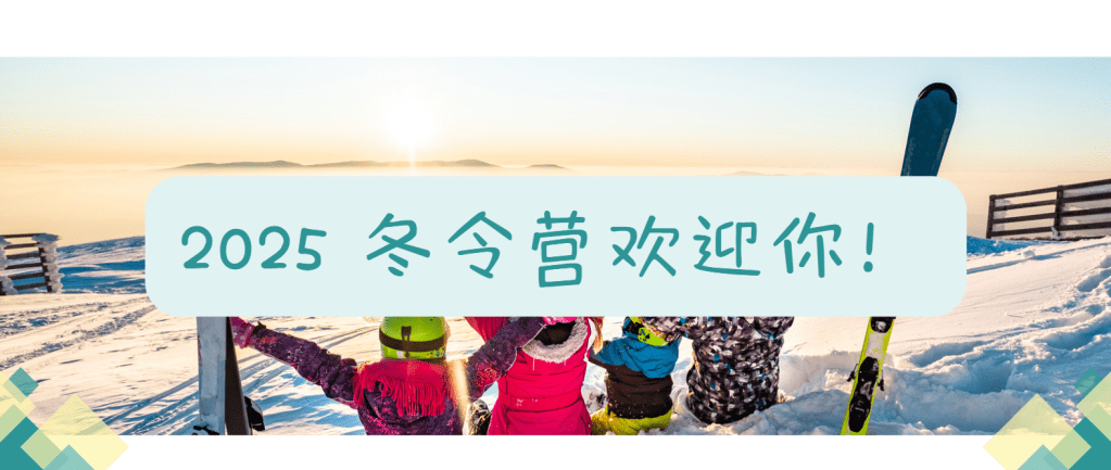
International Youth Program
The International Youth Program (IYP) is an international educational initiative aimed at helping students broaden their horizons and enhance cross-cultural understanding and global perspective through language learning and cultural exchange.
Table of Content
My Role
Brand Designer
Photographer
Tools and Durations
Tools:
Adobe Photoshop.
Adobe Illustrator
Canva
Duration:
3 Month
Deliverables
Brand visual identity design
Social media platform design
Scrapbook design
Design Style & Color Palette Explanation

The chosen color palette combines vibrant teal and soft yellow tones to reflect the energy and positivity of the International Youth Program (IYP). These colors create a lively and approachable aesthetic, perfectly aligning with the program’s youthful and dynamic spirit.
Scrap Book Design
Purpose:
This scrapbook is designed to provide participants with a keepsake to cherish their memories, capturing the highlights, interactions, and personal experiences from the program. It serves as a meaningful way to relive these moments while strengthening the sense of connection and engagement with the brand, enhancing the overall experience.
Gaining In-Depth Insights Into the Program as a photographer:
In addition to designing the scrapbook, I also served as the photographer for the summer camp. I gained a deeper understanding of the students’ needs and wants, as well as the camp’s daily routines and operational processes. This firsthand experience allowed me to capture authentic moments and integrate meaningful content into the scrapbook design.
Target Audience
The primary audience for the scrapbook includes students, parents, and study abroad agencies.
Study Abroad Agencies: Agencies collaborating with IYP can use the scrapbook to showcase the program’s highlights and outcomes, leveraging it as a promotional tool to attract new students and strengthen their partnership with IYP.
Students: They can use the scrapbook to document their experiences, attach photos, and write personal reflections, making it a lasting memory of a unique journey.
Parents: The scrapbook allows parents to gain a deeper understanding of their child’s growth and achievements during the program, serving as a bridge for meaningful conversations.
Scrap Book Design Process
Page layout
The page layout is carefully planned to include various sections that provide a clear and organized flow for the scrapbook. Each section has a specific purpose, allowing for both visual and textual engagement.


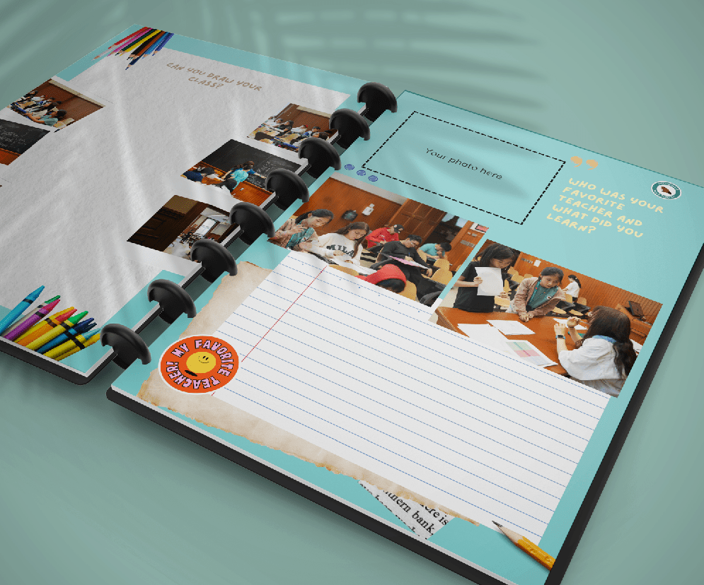
Interactive Section: This area is dedicated to student engagement, offering space for activities such as journaling, stickers, and creative drawings. It encourages personal interaction with the content, making it more fun and memorable.

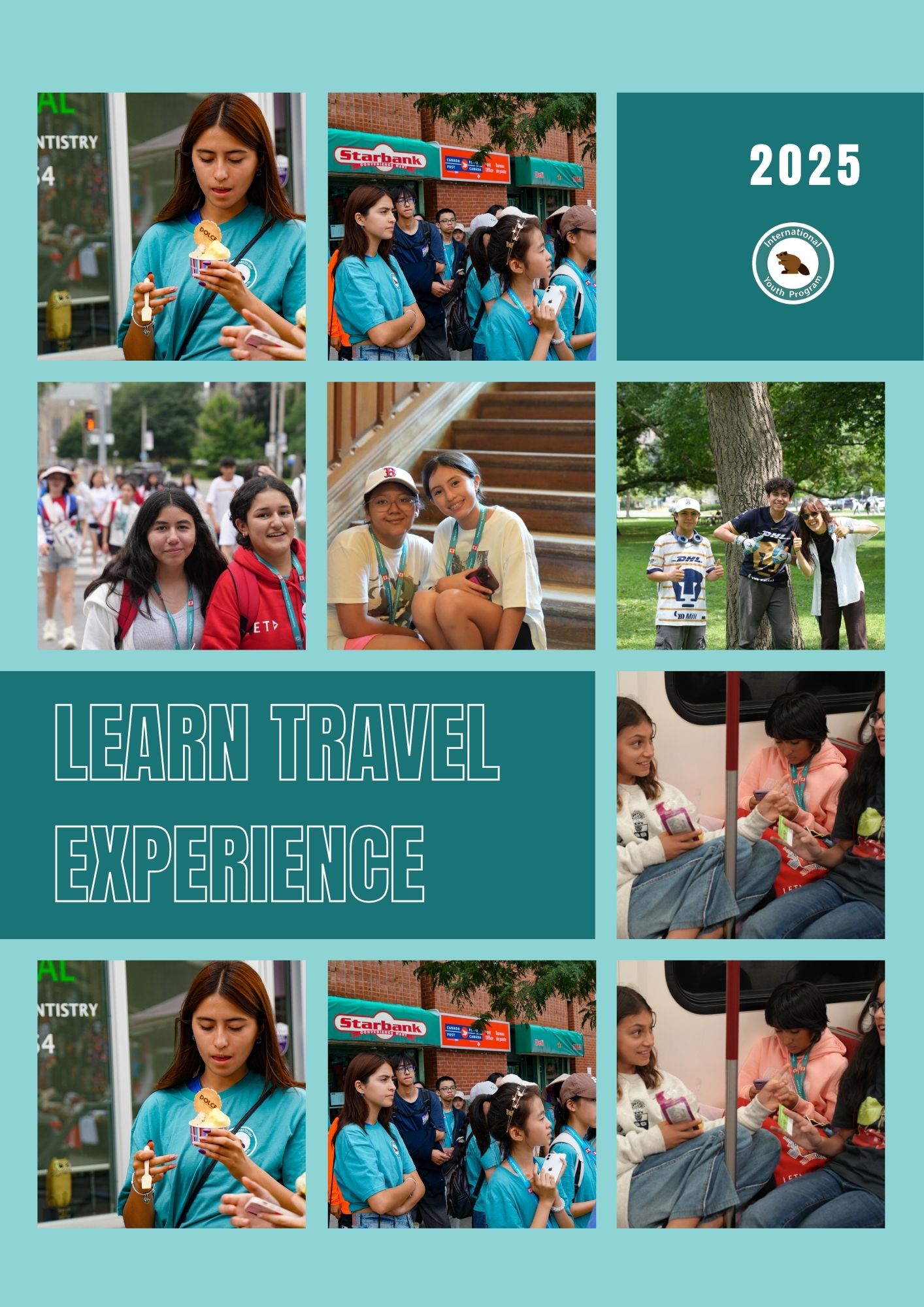
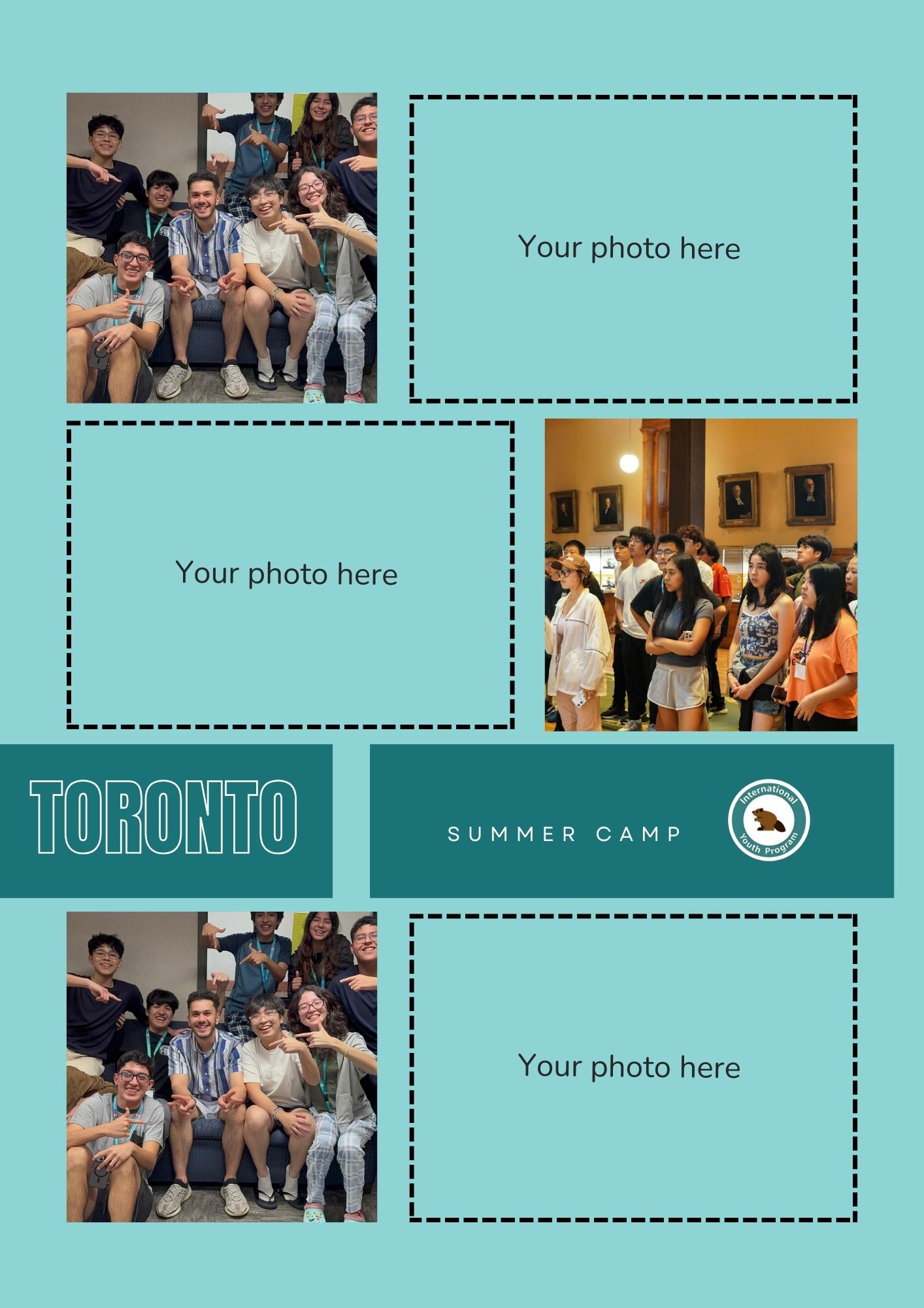
Photo Display Section: This area is used to showcase the photos for most memorable and relevant images. It helps visually narrate the experiences, giving a strong visual connection to the students’ journey. Photos are strategically placed to accompany the descriptions and enhance the storytelling.


Text Record Section: This section is where students can reflect and share their thoughts. It includes prompts like, “What was your favorite activity?” and space for writing about daily experiences. This section provides a written narrative that complements the images.
Page Breakdown
This design aims to create a cohesive yet personalized scrapbook that reflects both the collective experience of the camp and the individual memories of the students.


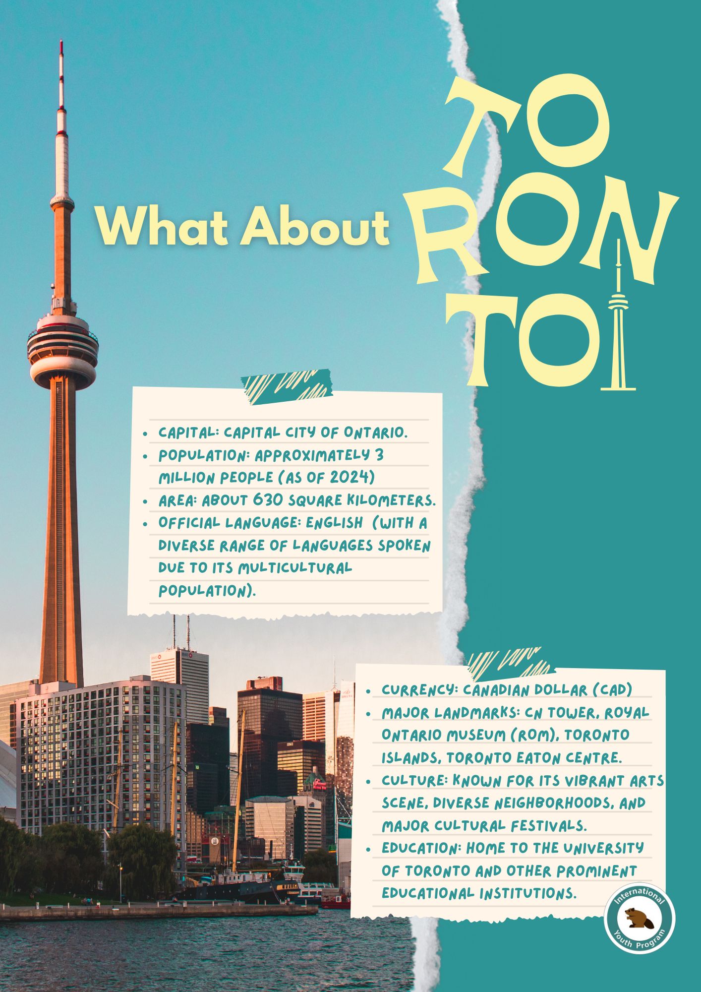

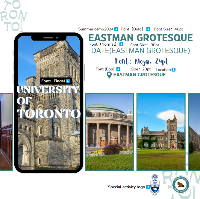
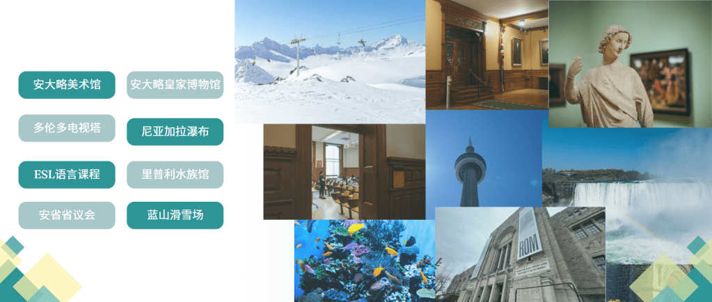
Canada and U of T Introduction: This section offers an overview of Canada, providing a brief introduction to its geography, culture, and history, with images that represent different parts of the country. And IYP’s main summer camp location University of Toronto‘s brief introduction.
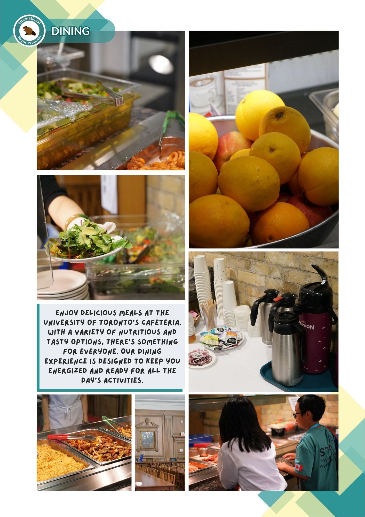
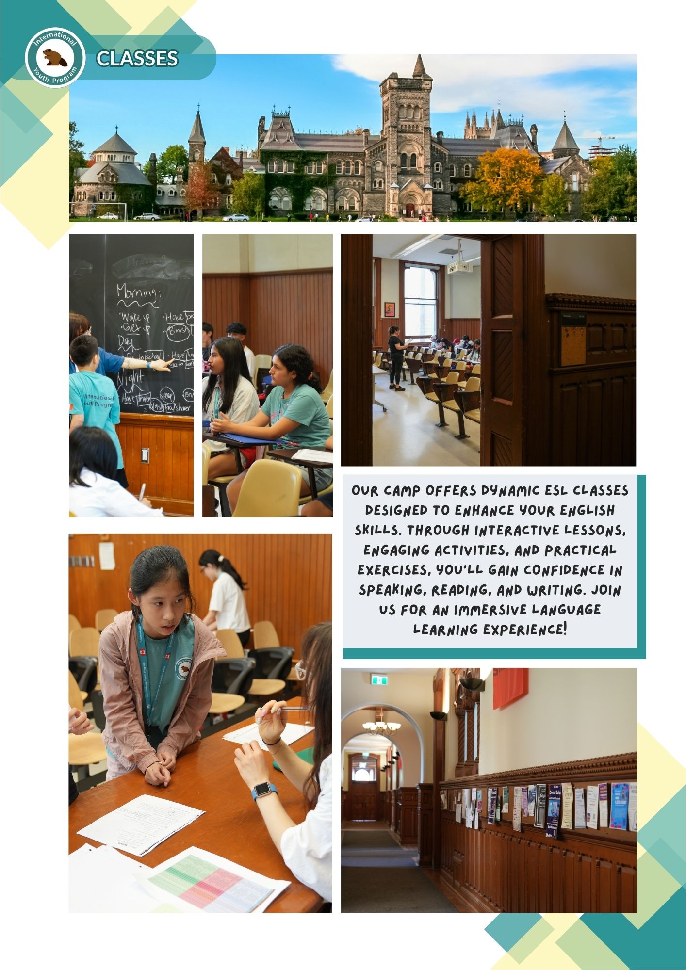


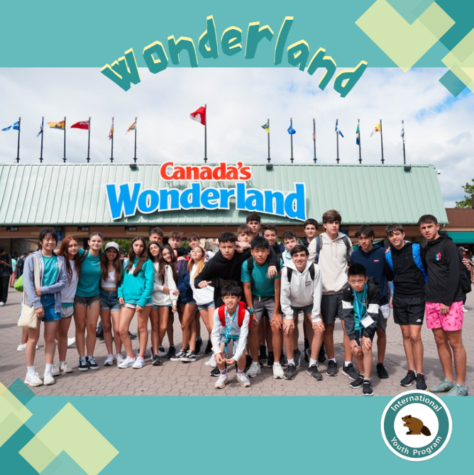
Summer Camp Introduction: This section gives details about the camp’s facilities, including the accommodations, dining hall, classrooms, and activities. Each aspect is highlighted with images and short descriptions.


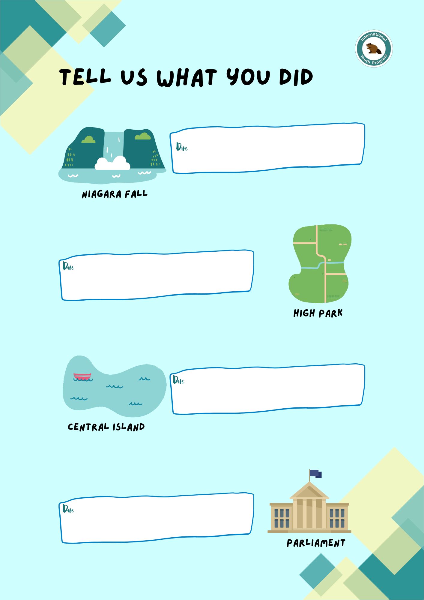
Activity Record: Here, students can track their daily schedules, adding their favorite stickers and personal notes. It includes a section where students can record the most exciting moments of different activities, complete with photos they can paste to document their experiences. Additionally, a “Favorite Activity” section allows students to highlight the activity they enjoyed the most, with space for photos and drawings.

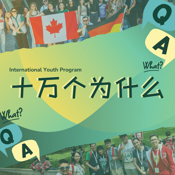
Personality Record:: In this section, students are encouraged to reflect on their friendships and relationships at camp. They can draw pictures of their favorite friends and write about them. There’s also space for teachers to leave a personal message or a note, and a section for students to draw their classroom or other favorite spaces within the camp.
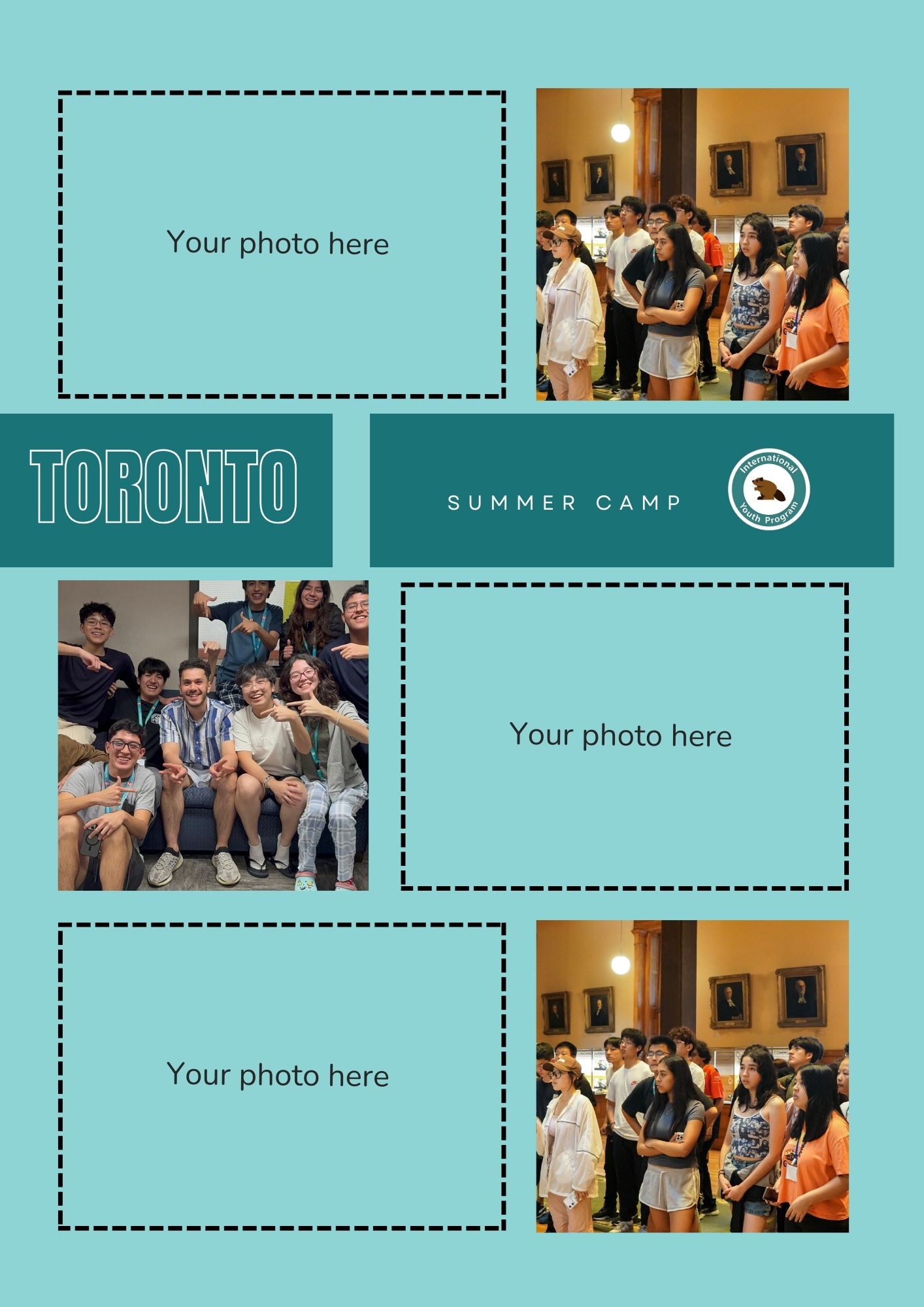

Photo Collage: A collage of photos can be created, showcasing the most memorable moments of the camp experience. The layout will allow for a creative and free-flowing arrangement of images, capturing the essence of the summer camp experience in a visually engaging way.

Color and Font Selection:
The color palette is IYP company color pallet to reflect it’s vibrant and welcoming culture, ensuring visual consistency and a strong brand identity. The typography is playful and lively, enhancing the overall visual identity of the brand, resembling child’s handwriting, which adds a fun and youthful touch while ensuring readability. and staying true to its cultural values of inclusivity and fun.
Material Usage:
Images capture key moments and are edited for vibrancy, complemented by playful illustrations. Graphic elements like doodles, icons, and stickers reflect a dynamic, youthful spirit, carefully arranged to maintain balance and enhance the theme of adventure and creativity. The scrapbook uses heavyweight paper for a premium, tactile feel, adding to its visual appeal and durability.
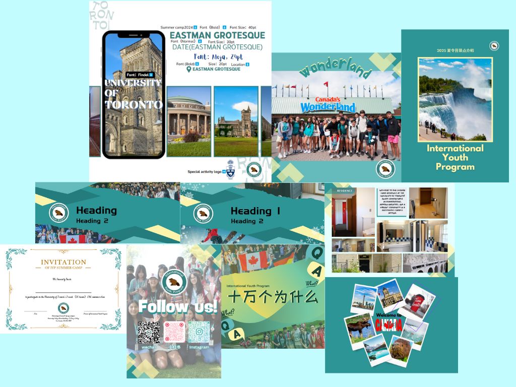
Social Media Platform Design


IYP Social Media Unified Design
I created standardized social media templates for IYP activities, with clear guidelines for font size, placement, and layout. Each activity has a distinct template, tailored to its theme while maintaining IYP’s visual identity, ensuring consistency and flexibility across platforms.

Design for Specialized Platforms I designed platform-specific templates for WeChat and Zhihu, Wechat user are one of our primary target audiences. considering its unique formatting requirements, such as smaller dimensions compared to other platforms. These templates are optimized for features like article headers, article covers, and event introductions, ensuring seamless usability and visual appeal. While tailored to WeChat’s specific needs, the designs maintain IYP’s consistent brand identity, ensuring cohesive branding across all platforms.
